How to Create a Color Palette for Your Brand Identity
A color palette is a crucial part of brand identity. It visually communicates your brand's personality, values, and emotions. A well-chosen palette enhances brand recognition, ensuring consistency across all platforms. From logos and websites to marketing materials and social media. By strategically selecting colors that align with your brand's message, you can attract the right audience and build stronger emotional connections. In this blog we will go over how to create a color palette for your own brand identity.

Jordan Wu
14 min·Posted

Table of Contents
Brand Identity
Brand identity is the visual and strategic representation of a brand. It's how a business presents itself to the world and how people recognize and remember it. A strong brand identity is a clear, consistent, and memorable representation of your brand's personality, values, and mission. It goes beyond just a logo. It's the visual and strategic foundation that shapes how your audience perceives and connects with your brand.
Key Elements of a Strong Brand Identity:
-
Distinctive Logo – A unique, easily recognizable symbol or wordmark that represents your brand.
-
Consistent Color Palette – A set of colors that evoke the right emotions and reinforce brand recognition.
-
Typography and Design Style – Carefully chosen fonts and design elements that align with your brand's personality.
-
Cohesive Visuals and Imagery – Photos, icons, and graphics that create a unified brand experience.
-
Clear Brand Voice and Messaging – A well-defined tone and communication style that resonates with your audience.
-
Mission and Values – A strong purpose and core values that guide your brand's identity and decisions.
-
Consistency Across All Platforms – Unified branding across websites, social media, marketing materials, and packaging.
Having a consistent color palette plays a vital part of brand identity because it visually communicates your brand's personality, emotions, and values. Colors evoke psychological responses and influence how people perceive and connect with your brand. A well-defined palette ensures consistency, making your brand more recognizable across different platforms.
Before picking the colors that align with your brand. You should define your mission and values. Your brand's mission and values shape your brand personality, tone, and messaging, which in turn influence the colors that best represent your brand. Color is one of the most powerful elements of brand identity because it directly influences how people see, feel, and remember your brand.
Color Theory
Color theory is the science and art of using colors to create visual harmony, evoke emotions, and communicate meaning. By definition color is the perception of different wavelengths of light as interpreted by your eyes and brain. It is a visual characteristic of objects, light, and surfaces based on the way they absorb, reflect, or emit light.
For example, imagine you're looking at a red apple. The apple appears red because it absorbs all other colors of light except red, which it reflects into your eyes. Your brain then interprets that reflected light as the color red.
Primary Colors
Primary colors are the three base colors that cannot be created by mixing other colors. They serve as the foundation for all other colors.
Red, Yellow, Blue (RYB) – Used in traditional art, painting, and design.
- Red
- Yellow
- Blue
Red, Green, Blue (RGB) – Used in digital screens and light-based color systems.
- Red
- Green
- Blue
Cyan, Magenta, Yellow, Black (CMYK) – Used in printing.
- Cyan
- Magenta
- Yellow
- Key (Black)
Secondary Colors
Secondary colors are the colors created by mixing two primary colors in equal amounts. They form the next level of the color wheel and serve as the foundation for more complex color combinations.
RYB (Traditional/Painting Model) – Mixing Red, Yellow, and Blue creates:
- Red + Yellow = Orange
- Yellow + Blue = Green
- Blue + Red = Purple
RGB (Digital Screens/Light Model) – Mixing Red, Green, and Blue creates:
- Red + Green = Yellow
- Green + Blue = Cyan
- Blue + Red = Magenta
CMYK (Printing Model) – Works in reverse from RGB, but secondary colors in this model are similar to the primary colors in RGB:
- Cyan + Magenta = Blue
- Magenta + Yellow = Red
- Yellow + Cyan = Green
Tertiary Colors
Tertiary colors are created by mixing a primary color with a secondary color that is next to it on the color wheel. These colors add more depth and variety to the color spectrum and help create balanced, visually appealing designs.
Warm Colors
Warm colors evoke energy, passion, and excitement, drawing attention and creating a sense of warmth. They appear to advance, making objects feel closer and more dynamic.
- Red
- Orange
- Yellow
Cool Colors
- Blue
- Green
- Purple
Cool colors convey calmness, trust, and professionalism, promoting relaxation and stability. They seem to recede, making spaces feel larger and more serene.
Color Wheel

A color wheel is a circular diagram that visually represents the relationship between colors. It helps artists, designers, and brands choose harmonious color combinations. The wheel is divided into primary, secondary, and tertiary colors, forming a structured guide for mixing and pairing colors. It also charts their respective hues, tints, tones, and shades. By visualizing how each color relates to the color that comes next to it on a rainbow color scale, the color wheel helps designers to create color palettes that creates harmony.
Hue
- Hue is the pure color on the color wheel without any black, white, or gray added.
- Examples: Red, Blue, Green, Yellow (all primary, secondary, and tertiary colors are hues).
Tint (Hue + White)
- A tint is created when white is added to a hue, making it lighter.
- Example: Adding white to red creates pink.
Shade (Hue + Black)
- A shade is made by adding black to a hue, making it darker.
- Example: Adding black to blue creates navy.
Tone (Hue + Gray)
- A tone is created by adding gray (black + white) to a hue, reducing its intensity and making it more muted.
- Example: Adding gray to green results in an earthy, olive green.
Color Picker
The color picker is a tool that lets you select, adjust, and customize colors for your design projects. It provides various color models like RGB, CMYK, HSB, and HEX, making it essential for digital art, branding, and photo editing.
The HSB (Hue, Saturation, Brightness) model is a way to define and adjust colors based on human perception. It helps designers and artists fine-tune colors easily in a color picker.
#e5b80b
Hue defines the pure color on the color spectrum. Adjusting hue shifts the color to another point on the spectrum. This would be the hue slider below the color spectrum.
Saturation (intensity of the color) controls how vibrant or dull the color is. Lowering saturation reduces the color's intensity, making it look faded or muted. Moving Left → Right on the color spectrum changes saturation (dull to vibrant).
Brightness determines how light or dark the color appears. Lowering Brightness makes the color darker, eventually turning it black. Moving Top → Bottom on the color spectrum adjusts brightness (light to dark).
Psychological Effects of Colors
Color psychology explores how different colors influence human emotions, perceptions, and behaviors. Colors can evoke specific feelings, shape brand identity, and impact decision-making.
Here's how different colors evoke emotions:
- Red represents passion, energy, power, and urgency, evoking strong emotions like love, excitement, and determination.
- Orange represents enthusiasm, warmth, excitement, and creativity. It's a bold and energetic color that combines the passion of red with the happiness of yellow.
- Yellow represents happiness, optimism, and warmth, evoking feelings of positivity, creativity, youth, joy, and playfulness.
- Blue represents trust, calmness, and reliability, evoking feelings of security, professionalism, and stability.
- Green represents growth, balance, and harmony, evoking feelings of nature, health, and prosperity.
- Purple represents creativity, luxury, and mystery, evoking feelings of sophistication, wisdom, and spirituality.
Color Palettes
A color palette is a set of colors chosen for a design, brand, or project to create a cohesive and visually appealing look. It helps establish a consistent identity and evokes specific emotions or messages. Adobe Color provides a color wheel that helps create color palettes for a hue with different modes.
https://color.adobe.com/create/color-wheel
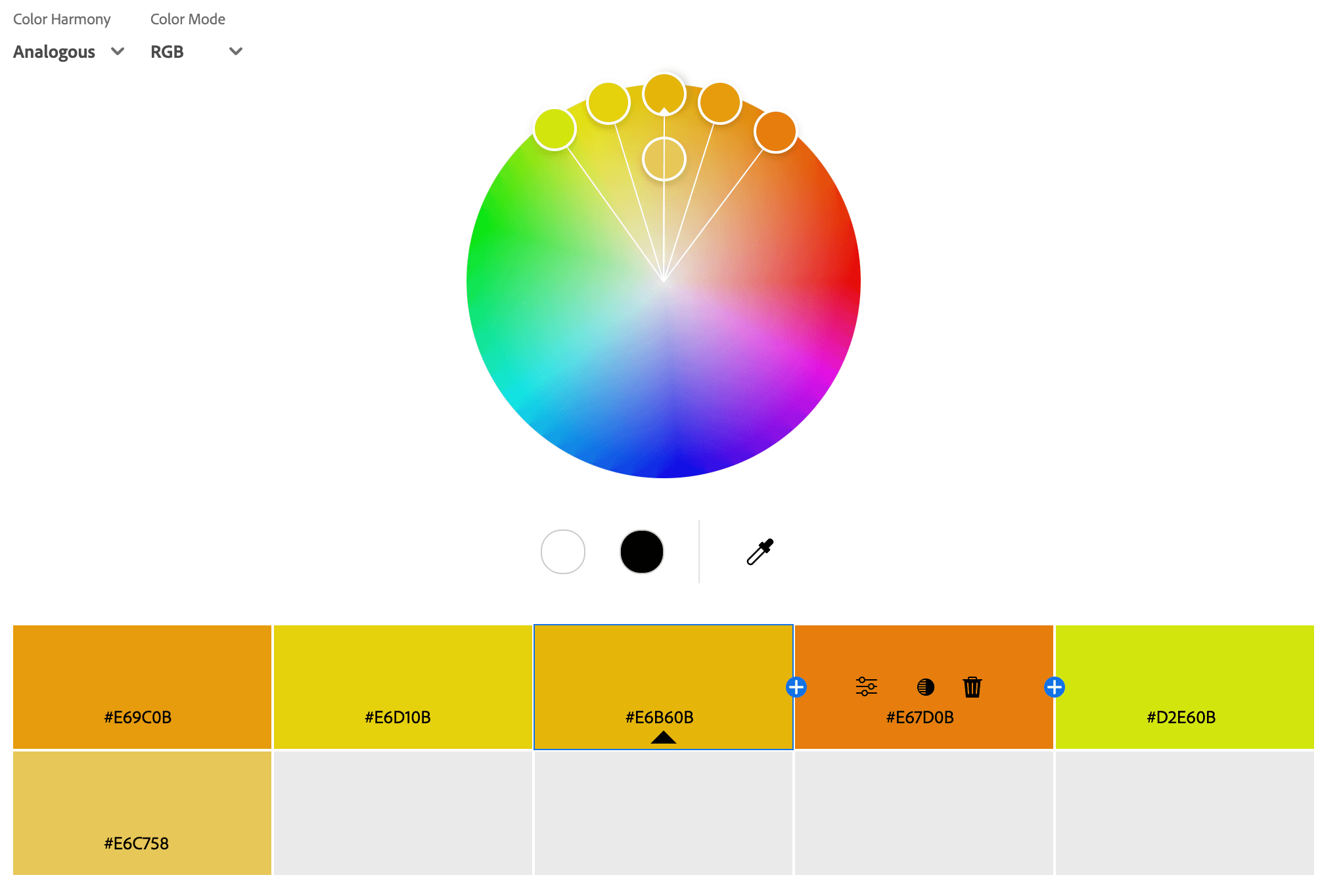
Analogous Color Palettes
An analogous color palette consists of three to five colors that sit next to each other on the color wheel, creating a harmonious and visually pleasing look. These colors share a common undertone, making them blend naturally while still providing contrast. Analogous palettes are often inspired by nature (e.g., blue, teal, and green in the ocean) and are commonly used in branding, interior design, and art to evoke a sense of cohesion and flow. This color scheme works well for calming, warm, or energetic designs, depending on the chosen hues.
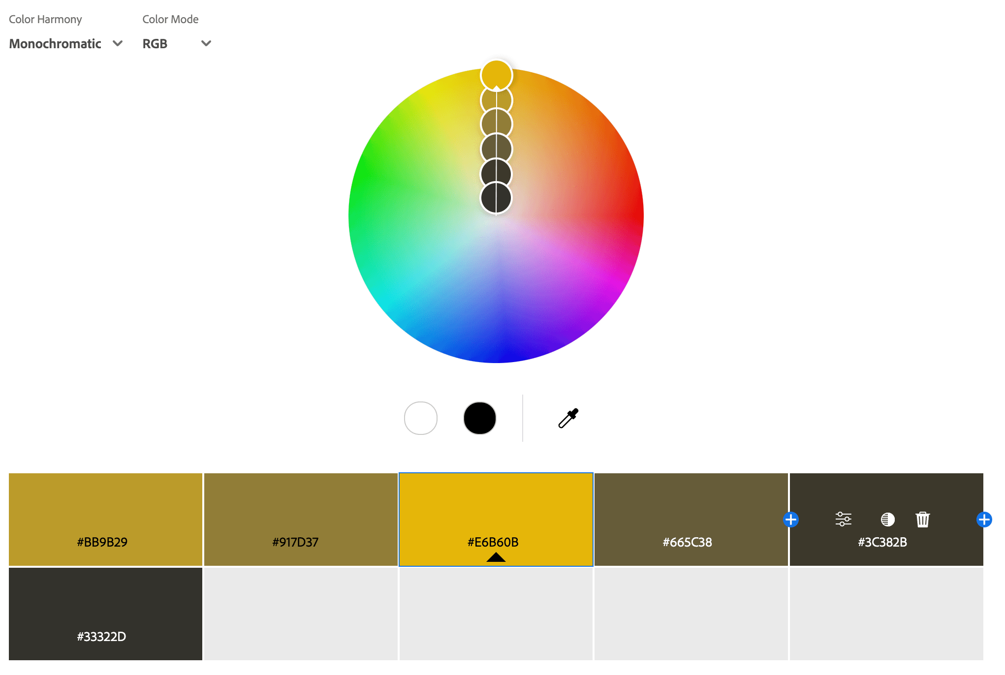
Monochromatic Color Palettes
A monochromatic color palette consists of different shades, tints, and tones of a single color, creating a harmonious and cohesive look. By adjusting the lightness or darkness of the base color, designers can add depth and variety while maintaining a unified aesthetic. This type of palette is often used for elegant, minimalistic, and sophisticated designs, as it provides a sense of balance and consistency without overwhelming the viewer. Monochromatic schemes are commonly seen in branding, fashion, and interior design to create a polished and professional feel.
Triadic Color Palettes
A triadic color palette consists of three colors that are evenly spaced on the color wheel, creating a vibrant and balanced look. This type of palette offers a high level of contrast while maintaining harmony, making it visually dynamic without being overwhelming. Triadic schemes are often used in bold and energetic designs, as they create a sense of excitement and playfulness. A common example is the primary color triad (red, blue, and yellow). This palette is great for branding, artwork, and marketing when aiming for a colorful yet cohesive visual identity.

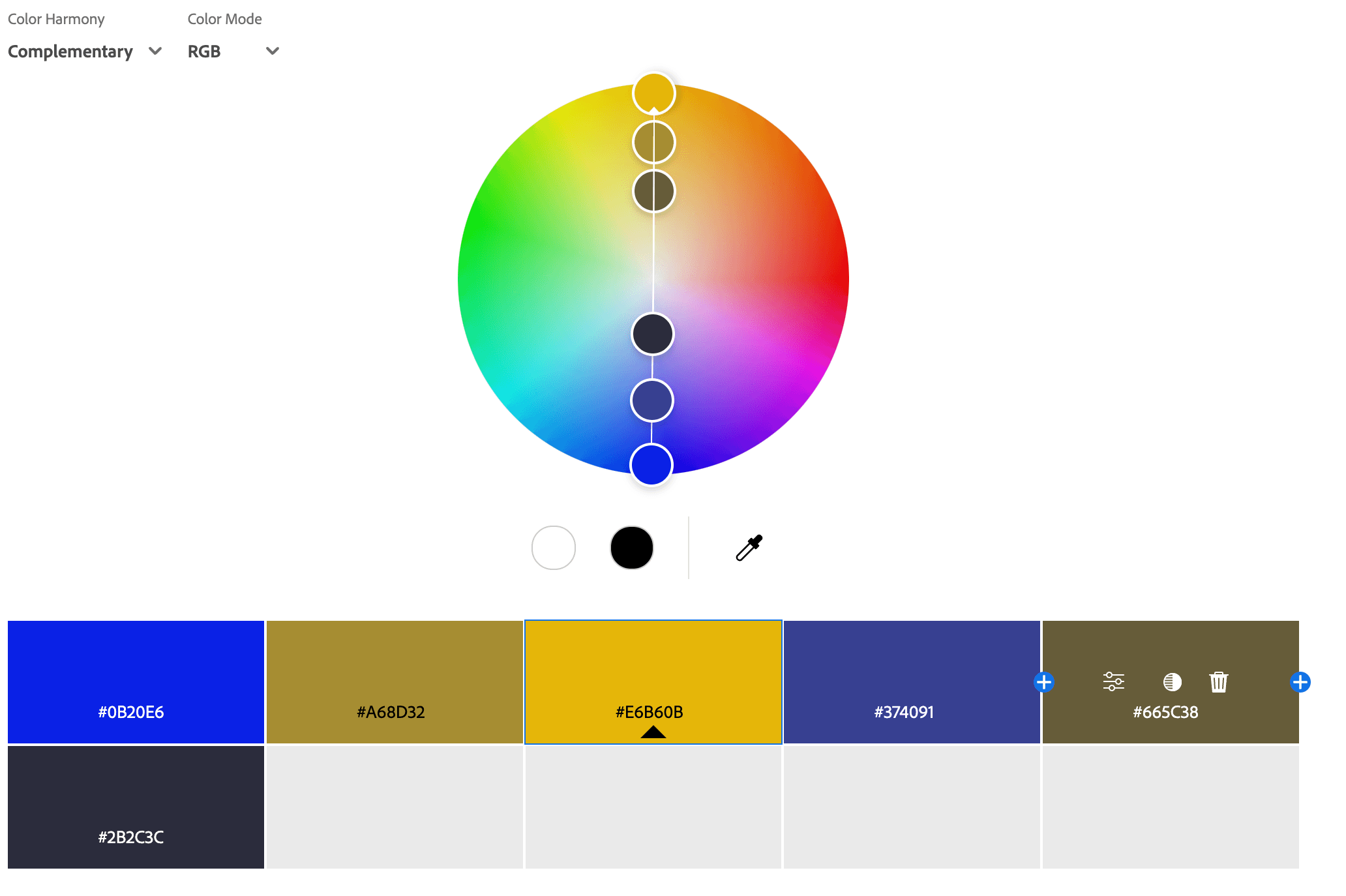
Complementary Color Palettes
A complementary color palette consists of two colors that are directly opposite each other on the color wheel, creating high contrast and visual impact. This color scheme is often used to make elements stand out, as the contrast between the colors makes them more vibrant when placed together. Common complementary pairs include blue and orange, red and green, or yellow and purple. This palette is frequently used in branding, sports team logos, and marketing to create a bold, eye-catching effect while maintaining balance. When used strategically, it can add energy and excitement to a design.
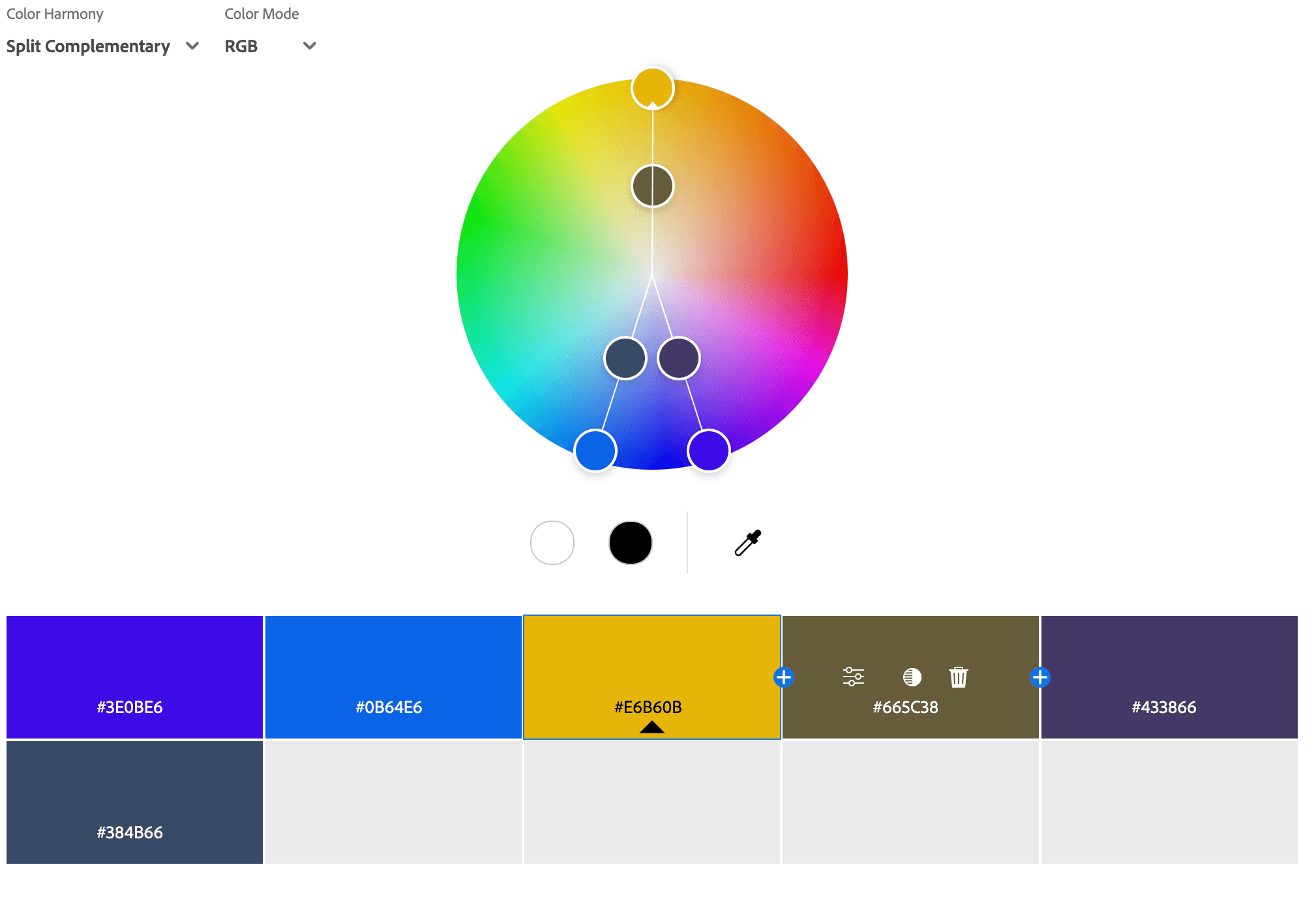
Split Complementary Color Palettes
A split complementary color palette is a variation of the complementary color scheme, consisting of a base color and the two colors adjacent to its direct complement on the color wheel. This palette offers a high contrast look like a complementary scheme but with a softer, more balanced feel. It provides visual interest without being too harsh, making it a great choice for designs that need contrast with a touch of harmony. For example, instead of pairing blue with orange (complementary), a split complementary palette would use blue with yellow-orange and red-orange. This scheme is commonly used in branding, illustrations, and web design to create dynamic yet aesthetically pleasing visuals.
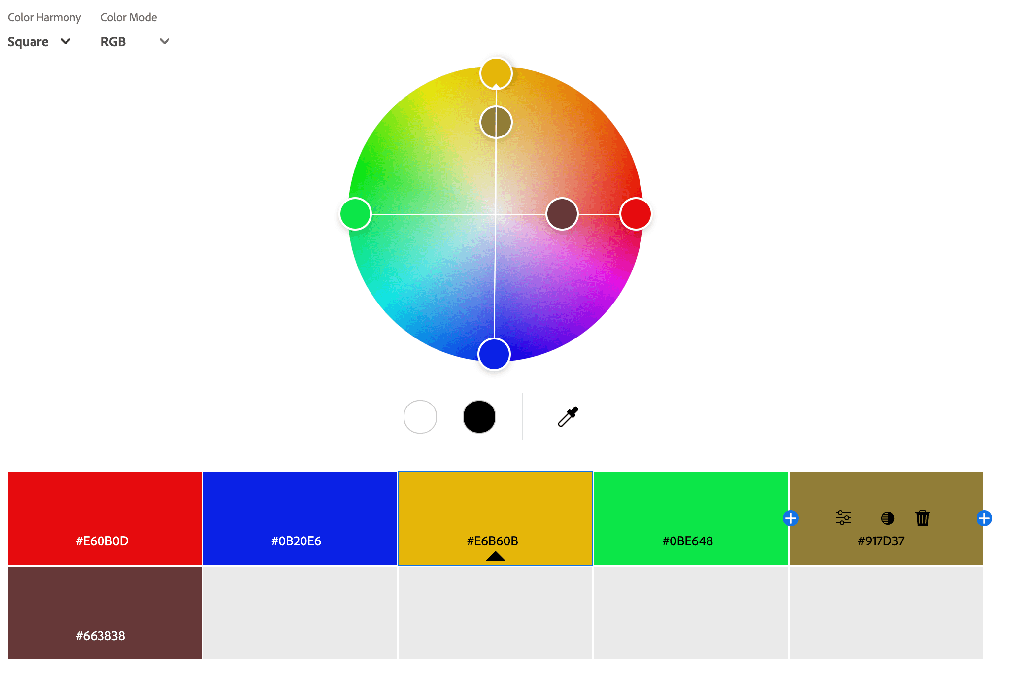
Square Color Palettes
A square color palette consists of four colors that are evenly spaced around the color wheel, forming a perfect square. This color scheme provides a balanced mix of contrast and harmony, making it visually dynamic and engaging. Unlike the tetradic color scheme, which can be warm or cool dominant, a square palette typically balances both warm and cool colors, creating a vibrant and diverse look. For example, a square palette might include red, yellow-green, blue, and violet. This scheme is commonly used in bold and playful designs, branding, and digital art, where a lively yet structured color combination is desired.
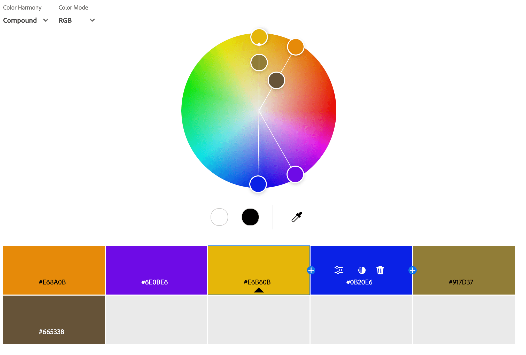
Compound Color Palettes
A compound color palette is a variation of the complementary color palette that includes a base color and the two colors adjacent to its direct complement. This palette maintains a high level of contrast like complementary colors but with a softer, less intense effect, making it more versatile and visually appealing. It allows for bold and dynamic color combinations while avoiding the harshness that pure complementary colors can sometimes create. This scheme is ideal for branding, web design, and marketing materials, where a balance of contrast and harmony is needed to create an engaging and aesthetically pleasing design.
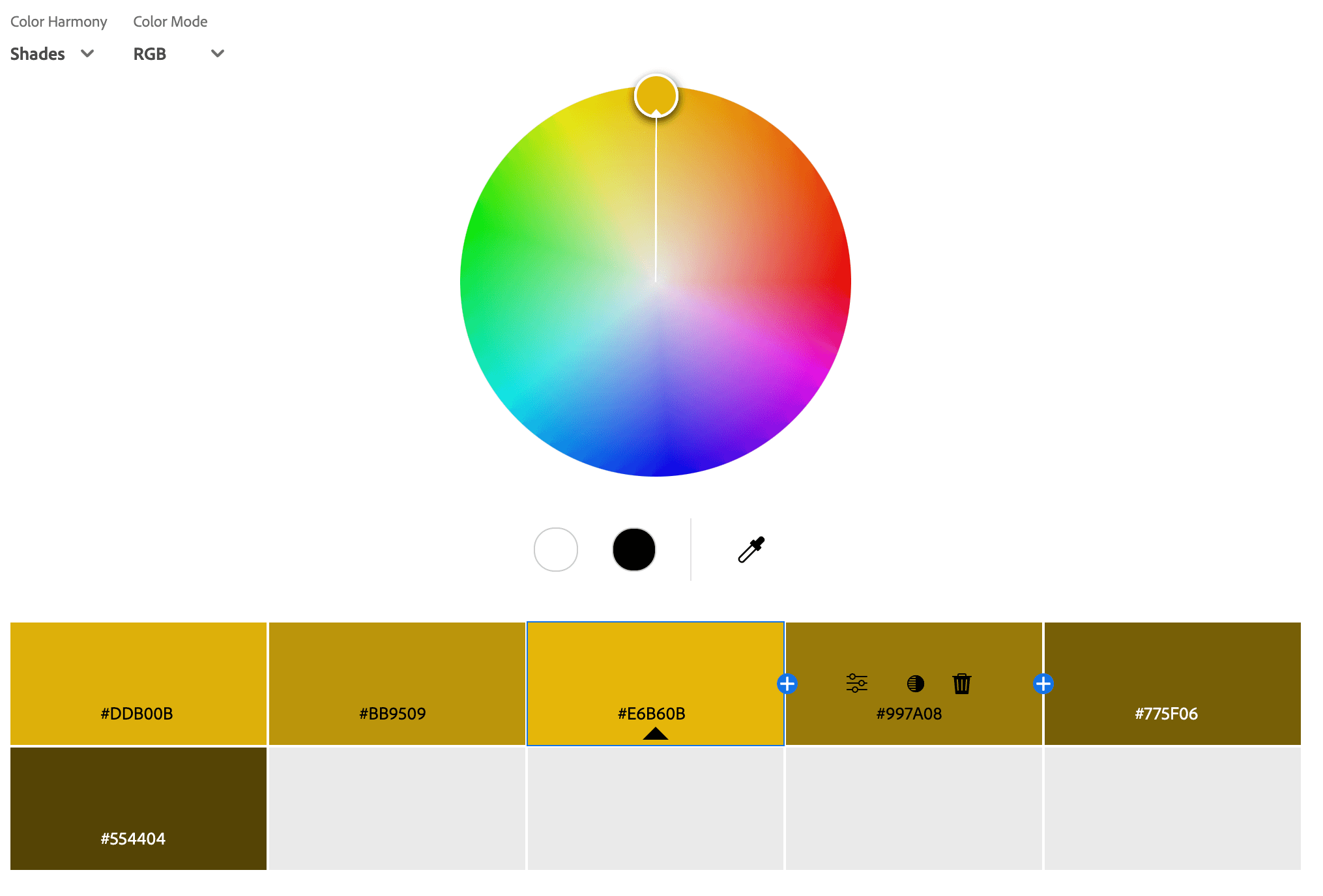
Shade Color Palettes
A shade color palette consists of a single base color that has been darkened by adding black, creating deeper and richer variations of that color. Unlike tints (which add white) or tones (which add gray), shades maintain the original hue while making it darker and more intense. This type of palette is often used to create depth, sophistication, and drama in designs, making it ideal for luxury branding, elegant interiors, and moody aesthetics. A shade color palette is great for conveying power, mystery, or intensity while maintaining a cohesive and visually striking look.
Contrast
Contrast plays a crucial role in a color palette because it affects readability, visual impact, and emotional response. High contrast between colors grabs attention, improves legibility, and creates dynamic, energetic designs, while low contrast offers a softer, more harmonious look. In branding and design, the right level of contrast helps guide the viewer's eye, highlight important elements, and ensure accessibility.
For example, using a light text on a dark background enhances readability, while contrasting accent colors can emphasize key details. Whether bold or subtle, contrast is essential for making a color palette visually effective and engaging.
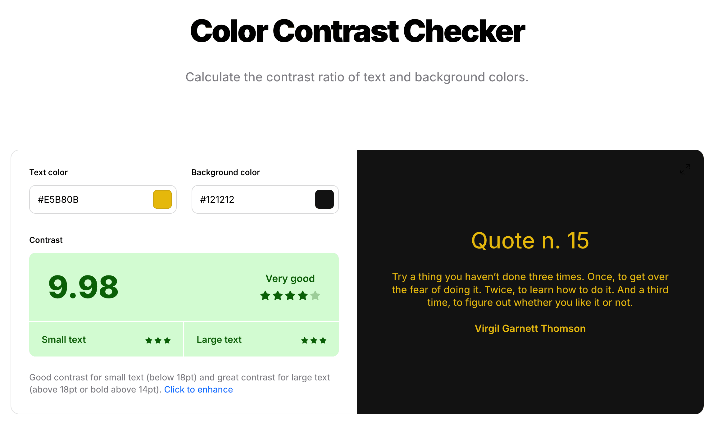
Here is a color contrast checker. https://coolors.co/contrast-checker
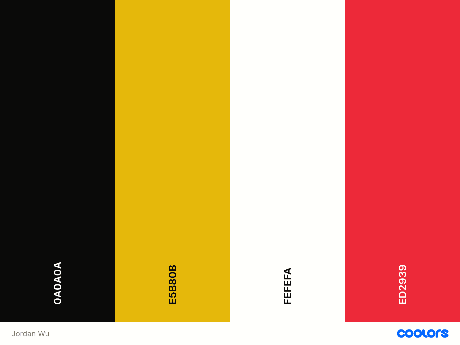
Summary
Creating your own color palette is essential for establishing a strong and cohesive brand identity. By carefully curating a palette that aligns with your message and audience, you can enhance brand recognition and ensure consistency across all platforms. For my color palette, I started by deciding how I want my brand identity to look. Black and gold. Next, I focused on the emotions I want my brand to convey: aggression, seduction, and euphoria. This guided my choice of hue, and from there, I worked with contrast to refine the saturation and brightness, ensuring the colors complement each other effectively.